Introduction
Due to public request here is a brief summary of the technique I use to generate ultra-enhanced structural geology images from bland fuzzy data images. They form the basis for much of my research and are so much more detailed than existing images that they have often been disbelieved??
However if you all can produce similar great images I’ll have the company of many discerning talented geoscientists and we can all find the next big one together.
I have been asked numerous times about my exploration targeting methods and how EagleEye plans help with targeting – so there is a synopsis at the end.
Commencement of Research.
This structural research commenced in the early 1990s using standard geophysical software (ER Mapper) on WMC gravity data from Wiluna to Norseman in the Yilgarn Craton of Western Australia. This was for exploration targeting. Here is the image showing a 200 km diameter ring centered north of Leonora that started this particular research (naturally named the Watchorn Ring structure!). I gave a talk on this structure in 2013 which caused quite a bit of controversy, https://www.youtube.com/watch?v=l0HdKnHomeA
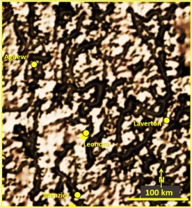
Nothing this detailed had been obtained from standard regional gravity data before and so no-one believed the structural results I obtained until I could show the actual faults and shear zones on the north Eastern Yilgarn geological maps for comparison.
Even now (22 years later) most geologists STILL can’t produce these detailed images from gravity, or other fuzzy images, and thus don’t use good structural geology to any extent. A situation I’m helping to remedy!
I used ERMapper a lot from 1990s to 2010. I’d observed that the functions in PowerPoint duplicated many of the ERMapper geophysics routines, only they do it better (if with a few wrinkles!).
This post comprises the LinkedIn post below with later added comments from other EagleEye users.
https://www.linkedin.com/pulse/summary-my-powerpoint-structural-enhancement-any-image-bob-watchorn/ post?
Most geologists still use fuzzy un-enhanced colour contour images as the base data for their research and exploration efforts. Why?? They need to do so no longer!
This post explains some of the details of my enhancement techniques extracted from various papers and email notes I have written over the last 5 years.
Methodology of enhancement.
From Watchorn YC#2 2017 (https://www.geotreks.com.au/work/giant-ring-structures/cauden-giant-ring-structure-enhancement/) ——
Normally raw images are not the best way of looking at the detailed geological structure of an area. This is because there is a mixture of short (local/shallow) and long (regional/deeper) signals (Nabighian et al, 2005) which blurs the image. There is also a great variation of signal strength caused by the lithology which swamps the structural data. This is similar (but worse) to the blurring in a typical photograph where only one depth is in focus, or all areas are roughly in focus.
A method was devised to strip away all of this extraneous data until only the signals relating to a certain depth/section are shown. The following instructions describes the EagleEye (an eagle sees a gray rabbit in gray bush from 2 km distance) method which is able to render the geophysical image amenable to having strong deeper structures outlined and interpreted.
EagleEye methodology.
Firstly, Microsoft Snipping Tool is used to transfer any image to the screen to work on.
Image correction functions in PowerPoint.
In order for any Pattern recognition, texture enhancing and edge enhancing software to function properly the main features that are to be studied must be highlighted. There must be sharp outlines and good contrast along the lines of the structure that is being sought for. There are many software packages that achieve this task.
The software package should include at least sharpness, brightness and contrast functions. This should be the first image formatting software used. If it is not used correctly then features won’t be visible and the other software functions will not achieve good results.
I use the Artistic Effects button (top left third button in) in PowerPoint as it is a one-stop-shop for enhancing and layering the images. It is also the most widely used and ‘freely’ available software that does this task.
Structure/pattern recognition software.
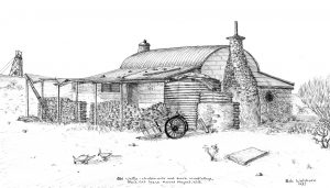
Being a keen pen and ink sketcher, and through editing pictures for book publishing, I know the power of translating a scene or photo into a planar image that shows all detail (see any of my pen and ink sketches on geotreks.com.au for examples).
A photo (read fuzzy unfocused geology or geophysical image) absolutely cannot get this ultra-detail!
There is software available that does this.
For instance, when a face/picture is to be sketched the software takes away all of the minor wrinkles and features just leaving a strong outline and the main features (structure) of the image. The details are accurate but only the bare bones of the facial structure is seen.
Similarly, if a structure is seen but is cluttered up with other data or there is not enough contrast to define it this software will strip away the clutter enabling the underlying structure to be observed.
For this I use PowerPoint – Image Artistic Effects.
Texture enhancing software.
There is a big difference between the physical properties of say a basalt flow and a series of basalt dykes and between an intrusive granite and a gneiss even though they may have identical magnetic intensities. Thus, it is difficult to discriminate between them on a geophysical image.
If structures that are composed of the same material transect a host rock of the same material it is even more difficult to see them. PowerPoint Texture enhancing in Artistic Effects software picks up the variation of the in-signal difference and highlights it with a texture that represents the texture being observed geophysically. Thus, even though the flow and dykes are indistinguishable by colour (signal strength) they are distinguishable by their texture (possibly caused by flow banding for example) and thus highlighted.
Colour contour plans will not do this!
Undesirable effects and how to ameliorate them.
Discussions on the techniques of EagleEye with LinkedIN colleagues over the last 4 years.
The following are discussions with EagleEye users that throw light on EagleEye’s idiosyncrasies and their resolution. There is repetition but they show that others have got the system to work in varying degrees, and found the same wrinkles I did!.
Maximising structural enhancement.
To A. L., September 2018 —
Bob Watchorn —— your last query about the program I use is explained in the paper I mentioned. It is simply the Artistic Effects programs in the Microsoft PowerPoint program. I have become adept at using it and have verified the geological structures produced at all stages of using the program. However, it is not a matter of just pressing the button and the structures leap out. At each stage of using the program there are 3 separate stages to use to clean up the image to make sense of the structures seen.
There are probably better programs available – like those police use for data enhancing and forensics and doctors’ MRI scans software, but for my simple purposes PowerPoint is ideal and free.
Bob to A. L, September 2018 — Bob Watchorn ——- the procedure for structural analysis of geological images is outlined below.
Are the images representing true geology?
Using the PowerPoint tools I did a full structural interpretation of a seismic tomographic image of Australia from Geoscience Australia (with the blue representing the base of the lithosphere/asthenosphere (cratons) at 250 km, the white is the continental crust base at ~150Km and the pink is the oceanic crust base at ~70km) and other tomographic sections in 2017. https://www.geotreks.com.au/work/giant-ring-structures/australian-lithosphere-tomography-75-to-300-km/. The features I defined correlated with known major structures and ring structures.
Details of procedure – to maximise structural enhancement.
I start by putting the image onto a slide, using Microsoft Snipping Tool, and use the PowerPoint picture tools/corrections button (sharpness, brightness and contrast) to get all of the data into a flat format by including as much low and high intensity data as possible. I put all the above to low settings (sharpness 0 – 100% brightness 0 – minus 30% and contrast 0 to – 30%)).
Then I use the PowerPoint picture tools/artistic effect/grayscale sketch button to make the structural boundaries stand out. All you will have at this stage is a slightly shaded, grey or black screen.
I then use Microsoft snipping tool to again digitally copy this image onto a new slide in PowerPoint. The aim of this is to set all of the picture formats back to zero so the above process can be repeated but using different settings. This also has the advantage of ‘dithering’ the image which aids in clarifying the structures.
Onto the reformatted image redo the Picture tools/corrections, over a few iterations, so the image is made brighter, then sharpened up and more contrast added until the structural features stand out. At this stage they may look like a tangled spiders web! You may need to repeat this exercise 4 – 5 times to clarify the structures.
When the structures are as clear as you can get them get a new snipping tool copy and you could use the picture tools/artistic effects/plastic wrap to strip away the clutter and make the main structures clearer. This feature puts in a central/radial ~ 45-degree sun angle and a wet look.
Once I have got that looking as clear as I can make it, I sometimes use picture tools/artistic effects/cement (pseudo horizontal derivative) to flatten the data which really highlights the structures. To get rid of the vertical and horizontal lines you need to use a higher transparency (>70%) and a small crack spacing (1-10).
With all of the picture effects buttons there is a transparency (overlay over the original) and pencil thickness (estimated structure width) sliders. It is the careful manipulation of these that give the best enhancement.
All of this takes a lot of practice to get good results. I regularly crosscheck back to the original image or other known geological data (and have field checked the structures) to make sure my structures are real and seen in other plans. However, with much of my work no-one (especially in seismic tomography) has successfully tried these techniques before (at least nothing that has been published) and so I have to refer the structures back to ones I know exist in other data (or in the field).
This process can be fine-tuned to enhance many different types and strength of structure on all data sources. It is especially good on Landsat and topographic plans.
It takes me about 20 minutes to get good results per image – but I’ve had a lot of practice —–
Discussion with another EagleEye user;
M. L. to Bob 2022 —– There is software induced fine crosshatching in the pencil greyscale.
….. I guess my main concern with the product is what artificial information may be introduced from the sketching filter; i.e. I’m still unsure if I can trust the crosshatch which appears to be generated from some kind of unknown algorithm..…
Bob’s reply to M.L. ….The real trick is to initially use the Pencil greyscale as described here. Make the image as fuzzy and dark as possible to collect all possible data. Then iterate it 3 + times to sharpen it up and get all of the background info on the image. This negates the regional slope of the image. I only use it at about 70% and pencil size of 1-4 at this stage to minimise the cross hatching you refer to. I also use enhanced contrast to keep the colours on the image. I get rid of the residual crosshatching by using Cement.
…… Then I use the Cement/Plaster, Glow Edges/Neon and Plastic Wrap buttons to get some ‘topo’ and a 3D effect.
Glow Edges/Neon. If used judiciously this is a very powerful (aggressive domaining) algorithm. It brings out structures better and more quickly than Pencil Greyscale. It is also very good for those worming effects I get and for definition of different domains. It acts like a double horizontal derivative with a 360 degree sunlight highlighting of the sharpest edges equally.
Cement/plaster produces a flat image – takes away regional and local slope. It also introduces a sun-angle from the NE. Cement has a gridding (regularisation?) function and produces a weak orthogonal NS and EW grid.
I get rid of this grid by reverting back to Pencil Greyscale after Cement. I was a bit suspicious that Cement imparted a false Sinistral sense of movement. So I used it on the same image tipped on its side and was satisfied that it didn’t. Others have also tried this and suggested that it is relatively impartial.
M. L. to Bob.…. I did practice on an area where we have really good lithostructural control and I’m also getting convinced about the merit of the technique. I’ve been exploring the conversion between pencil greyscale and pencil sketch. Pencil greyscale seems to introduce a 45-degree bias where there’s limited textural contrast and also some noise near corners (see first page in attached).
I’ve been using the plastic wrap sparingly; it looks like it introduces a general radial function of some kind (you can see on page 2). I have started using glow edge with transparency a bit more and I really like that filter.
I’ve also been exploring the photocopy filter which I think can give interesting results (similar to classical worming). And I also tried generating some pseudo lithology information with the cutout filter. I think that could be taken a bit further at some point. …..
Bob’s reply to M.L…….. I see you’ve found some of the idiosyncrasies of the EagleEye system. I’ve spent quite a bit of time figuring out how to minimise these software induced patterns – and largely succeeded.
With the Pencil Greyscale I don’t use anything over 4 in pencil size for the first few iterations. After a few iterations the magnitude of the real geological structures is much greater than the 45 degree angle ‘structures’ and it disappears. However to make sure I run the Cement/Plaster function which, if finessed, gets rid of them – but places an orthogonal NS EW grid on the image. By fiddling with the crack spacing this can be minimised and great structures come out.
Plastic Wrap is similar to the Wet Look in ERmapper. Part of it is a sun angle function. In this one instead of coming from one side it comes radially from the middle. This is especially good for seeing the rings, if looked at from the centre. The function itself does not generate rings. I’ve tried it from places all over the same image and it doesn’t form rings if there are no rings in the data. Another function of Plastic Wrap is to fill out and raise the dark features so that they have ‘body’ and stand out.
The combination of Pencil Greyscale, Plastic Wrap and Cement gives good results.
Glow Edge/Neon is good where there is plenty of contrast and the data is not too complicated. This is the one that I have been able to mimic Worms with.
It is also an excellent shading inversion tool which gives some fantastic structural detail I can’t get using other functions.
Put the top bar to the right and the bottom to the left and them fiddle with them. You’ll be surprised at the results……… (added later – for example if you have an image with so much contrast that a lot of the data is blank then juggling the sliders can even out the shading and give data coverage over the whole image – great! It does the same job as the histograph bar on the left in the old ERMapper software).
……. The number of iterations in Pencil greyscale depends on the quality and contrast of the original image.
If the original image is low contrast and poor quality I do up to 10 iterations gradually increasing the pencil size as the structures become clearer.
At the earliest opportunity I then do the Cement, Plastic Wrap or Glow Edges to minimise any induced structures.
Thanks for the colour filter information. I hadn’t tried that!
I had tried the saturation temperature settings with good results. I use them if I have to superimpose a similar looking plan and section and I want the section to stand out. So I colour it. This doesn’t change the structures. Have a look at the last North American post to see this in action https://www.geotreks.com.au/work/giant-ring-structures/western-hemisphere-seismic-tomography-200-km-plan-sections-of-africa-south-and-north-america-europe/ .
Are you able to give a geophysical description of what you think each function emulates in, say ERMapper?
I’ve done this and I’d be interested to see your take on it. For example the Cement emulates a double horizontal derivative. With sun angle from the SW. The Glow Edge emulates worming which also uses a double horizontal derivative but highlights differently, etc etc. The Glow Edge also is good for domain information and shade reversal. ……..
M.L. to Bob …… Glow Edge/Neon is definitely an edge detection but with some colour added which can be likened to domain classification – Jon Woodhead has developed a robust methodology in GIS to achieve this. The Photocopy filter is also an edge detection in my view but works more aggressively and reminds me of what you can do when you upward continue the data to reveal deeper structures. For the Cement/Plaster filter I suppose I agree with your assessment but the introduction of a grid pattern sort of precludes any direct comparison in my view – it’s almost as if it introduces some kind of coherent noise.
For the Pencil Sketch, I don’t think it relates to any existing filter, but perhaps overall has some affinity with the analytical signal calculation with a smidgeon of derivative (?). It is sort of an edge detection algorithm, with an added (scale-dependent) sharpening effect maybe (?), but more importantly with an angular interpolation function (Which doesn’t currently exist in geophysical filters). And I think this is the most important breakthrough. Most (all?) geophysical functions are smooth and generally generate blobby features (e.g. minimum curvature). Yet rock formations are brittle and sharp. My ultimate take on it is that it represents a matrixial transform from smooth to sharp and thus constrains the geophysical boundaries to more physical boundaries.
I’m not surprised most geophysicists would resist trying it out. After all they’ve been using minimum curvature and the rainbow palette for all their career ………
Bob to M.L. ……. You’re right the pencil greyscale is the killer! It is a structural recognition program by whatever method it uses and is different to what geophysicists use which are generally filters and derivatives.
My idea would be to obtain the software for MRI images which does exactly the same process but much better. Then adapt it. I’d reckon that like PowerPoint you’d just use it and see what happens and needs changing. ………
Exploration targeting rationale and the use of EagleEye plans for exploration targeting.
The very basics.
The main target areas are intersections of favourable stratigraphy and structures with the major linear and ring structures. This has been known, and generally accepted since the 1950s, (apart from a lot of debate about the rings).
The following post shows the relationship of mines to structures (darker areas) in the Yilgarn of Western Australia – https://www.geotreks.com.au/work/giant-ring-structures/yilgarn-geology-tomography/.
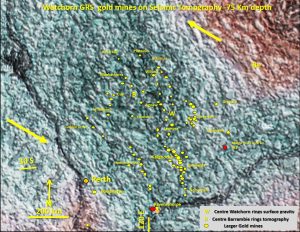
If anyone has any doubt on whether EagleEye produces structures in the Yilgarn Craton in Western Australia that relate to real structures, then this post shows that the general pattern of the structures is similar to that known from many years of mapping and geophysics. However the EagleEye structures are an order on magnitude more detailed. This is a plan from 2017 and the structures would be clearer in the 2022 version – might get around to it one day. There’s a task for up and coming champion explorers 🙂
The structural evidence From EagleEye now suggests that Exploration Targeting should encompass already recognised favourable structural and lithological loci around the giant ring structures especially outside the well explored areas. Targeting areas for nickel sulphide in the Yilgarn of Western Australia should follow the rings more closely.
My research has shown that the the giant ring structures, and the largest linears, are the most important structures controlling mineralisation in the cratons that cover Australia, China, Africa, the Americas and Europe. Use whatever ranking system you prefer but these structures are the prime movers of fluids!
I have done many posts that have exploration targeting plans in them. Trawl through Archives on geotreks.com.au to find them. If you’re an explorer it will be worth your while! Here is a small selection.
This post has an ultra-detailed look at the Carlin Bingham Canyon area with advice on targeting https://www.geotreks.com.au/work/giant-ring-structures/butte-carlin-bingham-canyon-mining-area-eagleeye-seismic-tomography-300-km-depth/.
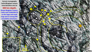
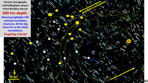
I did not draw the exploration targets on these two plans but those intent on finding a new Carlin can draw their own!
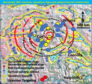
With the sudden interest in Vanadium the following Barrambie Uranium/Vanadium targeting post has had numerous visits. https://www.geotreks.com.au/work/giant-ring-structures/uranium-vanadium-yilgarn-barrambie-grs/
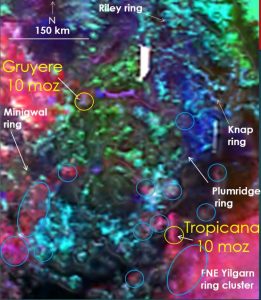
The Yamarna Gruyere/Tropicana radiometric targeting post is getting a hammering so expect some new discoveries there soon! https://www.geotreks.com.au/work/giant-ring-structures/plumridge-gold-mineralisation/.
Look at all those rings! All prospective!!
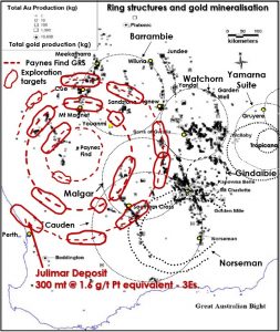
Since the discovery of the Julimar PGE-Ni-Cu-Co-Au deposit near Perth my Paynes Find post from 2017 https://www.geotreks.com.au/work/giant-ring-structures/paynes-find-magnetics-metallogeny-lhb/ has had lots of hits (The Julimar text is a recent addition!).
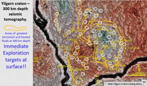
My Yilgarn targeting, from 300 km depth, post has also been busy with the activity in the West (Julimar), SW, NE (Gruyere) and SE (Nova) Yilgarn Craton discoveries – https://www.geotreks.com.au/work/giant-ring-structures/new-discoveries-correlate-with-watchorn-exploration-targeting-using-yilgarn-seismic-tomography-from-300-km-depth/.
I’m taking a well-earned sabbatical as I’ve been going at this research constantly since 2013.
This will be my last major post for quite a while (boating holiday around Australia until October 🙂
I will be open for queries on LinkedIN or the comments section on this website.
Cheers
Bob Watchorn

