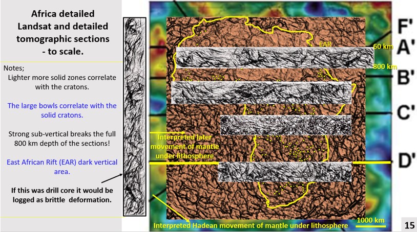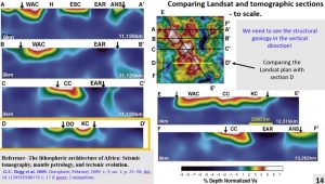
Tomographic section D-D’ from Begg et al., 2009, was examined. The surface structural Landsat plan was compared with the structural geology in the vertical plane in section D.
Note. The majority of this paper is a transcription from the video of the AusIMM Webinar at the Western Australian, South West Branch on the 30th July 2020. The language is thus vernacular and not geologese. This should make it more easily read and understood by the majority of readers.
Additions have been made to expand and clarify sections that were abbreviated due to time constraints in the Webinar. References quoted in the webinar, as well as background papers referenced but not quoted in the webinar, are listed in the text and in the references section at the end of the paper.
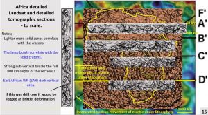
In this figure we have four tomographic sections. They are 800 km deep. If we look at the vertical section it looks like diamond drill-core with brittle deformation!
Current thinking is that there is brittle deformation only in the top crustal 50 km and maybe another 50 km of lithosphere. Under that is supposedly viscous/ductile mantle deformation (Ricard 2009).
So, these sections radically change our interpretation of how the Earth has evolved. We will be looking at section D to see how it correlates with the Landsat.
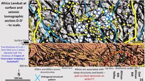
The Copper Belt in Zambia is lined up against Seismic tomographic cross section D which is 800 km in depth. The diamond mines form within the Kalahari Craton.
The Kalahari Craton in plan can be seen as the yellow bowl-shaped structure outlined in the section. The East African Rift and the African Rift Valley can be seen as vertical structures on the right-hand side of the section. Linear structures correlate from plan to section. NW linear structures dip east and the NE structures dip west.
The crust is very thin compare to the lithosphere. The true thickness of the crust on earth is the thickness of two tissue papers wrapping a basketball. The crust is generally very stable. This suggests that the lithosphere is also stable which is suggested by its brittle deformation.
7. African seismic tomographic research from 60 km depth to 400 km depth.
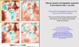
This is the tomographic data (Fishwick and Bastow 2011) that I used for Africa between 100 and 300 km. It is coarse, not really good data with contour and feature overlays and so if you can find better data, you’ll get better results than I did.
Seismic tomography is the reflection pattern of ambient seismic noise from hundreds of broadband seismic stations recorded by the Incorporated Research Institutions for Seismology Data Management Center located in Africa, the Middle East, and Southern Europe (Emyr et al, 2018).
60 km depth Tomography.
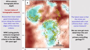
This figure shows the tomography of Africa from ~60 kilometres depth. It shows that the large, light-coloured areas, which are the cratons, are relatively consistent under most of the continent.
This research will examine the tomography at this depth in ultra-detail to find out whether the continent has accumulated (accreted) or has remained as one continent which has broken up over time.
I’ve placed the mines on the raw tomographic data and it can be seen that they follow the contour lines or are near the edges of cratons. Researchers are focusing on this feature lately.
However, WMC using gravity contours, recognised this as a targeting criterion in the late 1980s – 30+ years ago. Have we advanced very much in the last 30 years? Not really! It is no wonder that we have not found enough ore reserves for the last 15 years. We are not looking in any new places!
With this method of ultra-detailed enhancement we can now get structural detail which changes the way we can interpret large areas and will help us in targeting more successfully. If we can find detailed controlling geology for mineralisation this will be of great use in targeting.
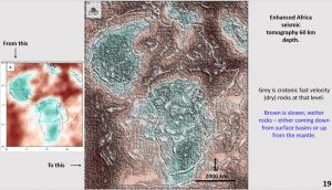
This figure shows mild enhancement of the seismic tomography. The enhancement is designed to retain the colour domains (heat of rock) and will show less detailed structure than a ultra-detailed structural enhancement.
Grey represents cratonic, fast velocity, dry, rocks. Brown represents possibly wetter, perhaps more plastic rocks with a slower velocity. The brown lithosphere at the top is filling the Central Sahara Rift and the East African rift. The brown lithosphere in the bottom left-hand has come up from the mid-Atlantic Ridge.
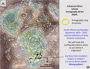
This figure shows mild enhancement with only the main ring structures superimposed. There are a lot more rings in the background.
Structural activity is usually accompanied by seismic activity. To gauge where the structural activity in South Africa originated, I needed to see if the earthquake pattern in South Africa (Singh et al. 2009) correlates with where the mines originate. The earthquake pattern doesn’t correlate with the 60 km depth or the surface geology.
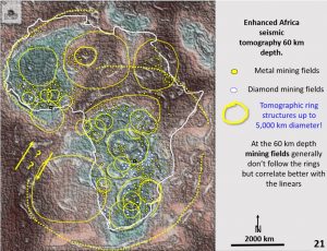
Positioning the mines on this plan shows that the mines don’t correlate very well with the rings either. They don’t correlate at 60 km depth and they don’t correlate with the surface geology.
However, the mines obviously correlates with deposition of metal but the fluids and heat that deposited this metal must come from a greater depth under the Moho.
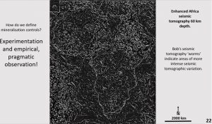
The figure shows worms. About 20 years ago they were all the rage and I figured out how to do them on ERMapper and I’ve now figured out how to do them on the very sophisticated geophysical program I now use – PowerPoint 😉. This proves that you don’t need $40,000 geophysical programs to get good results. My research consists of empirical, pragmatic observation and experimentation using simple everyday tools.
On this figure you can see 11,000 km linear structures extending from the top of the figure to the bottom in an NNE direction and NW structures extending from the middle of the figure on the left to the bottom right hand corner. Ring structures are not as visible.
We’ll see what correlates with these linear structures in the next figure. Often the linear structures show up as discrete lines of white but here they also they show up as zones with no seismic reflection. Interestingly these passive zones also have very few mines. Could we cut down our targeting area by avoiding them?
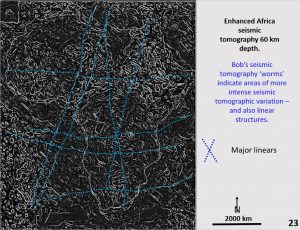
The linears are plotted on this figure trend NNE and EW and there is an orthogonal pair running down the centre of Africa. Do they correlate with mines?
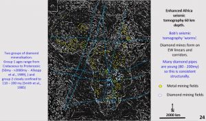
Looking specifically at the diamond mines one can see that they generally follow the EW structures. As the diamond mines are generally younger, only 80 to 200 million years, they would be expected to follow later brittle structures. The metal mines can be seen following the ring structures in many places.
This plan is a good broad-scale targeting tool. Follow the rings for the metal mines and the EW linears for the diamond mines. I won’t be doing much targeting as I expect geoscientists who want to find new mines will learn how to ultra-enhance images and do their own targeting. I’m retired and don’t have the time 😊
For the previous papers on Africa geology and other continent summaries go to Geotreks.com.au

